Allen Digital

Product Illustration for UI
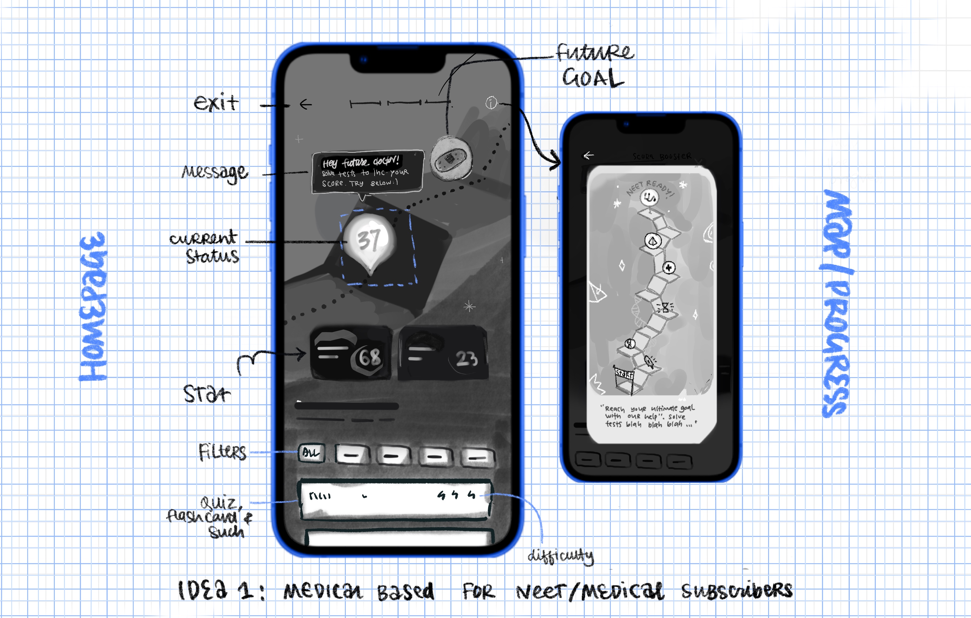
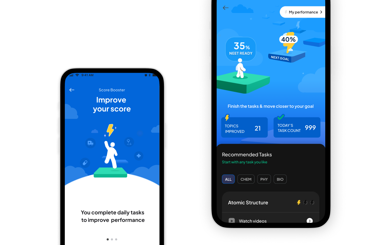
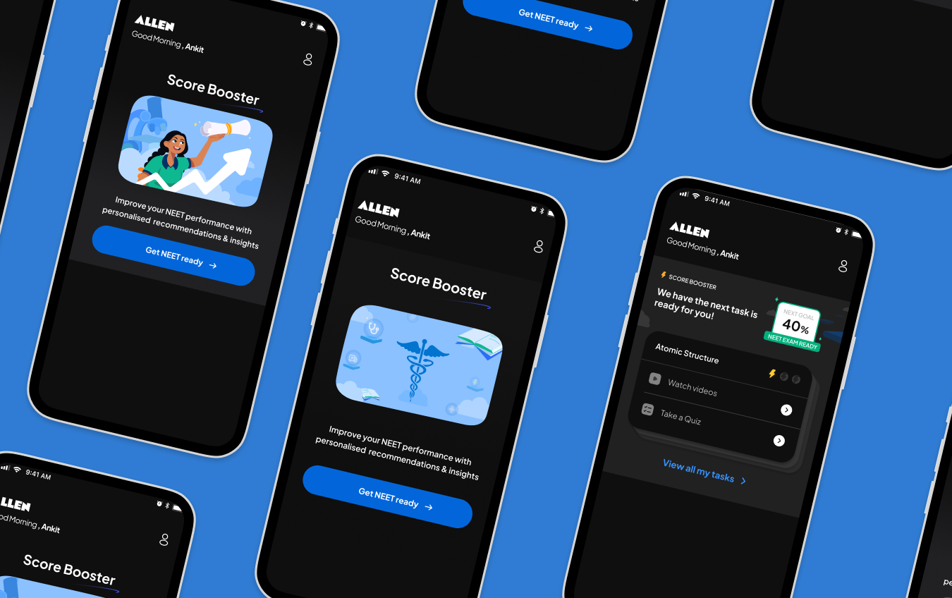
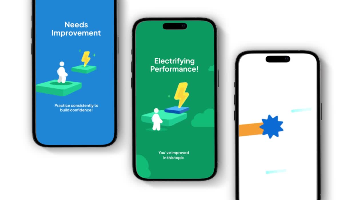
Allen Digital is the leading digital platform for one of India's most intensive coaching institutes - Allen Institute, serving adolescent students all over India dedicated to cracking highly competitive entrance exams like those for medicine and engineering. The platform offers a wide range of features from notes and quizzes to flashcards, all aimed at managing the extensive study load.

01

Problem
To make an gamified, appealing feature for the crème de la crème of student toppers of the Allen Institute to improve their score for their competitive exams.  
Roles
Illustrator and Visuals for UI
My primary contribution was establishing this core visual aesthetic, character design, and foundational storyboards. I delivered the conceptual groundwork, including character sheets and the initial storyboards and key frames for the "power-up" moments.
Also working on this was UI designers Sukriti Dhariwal and Ankit Mishra led by Neelam Gulrajni
Context
For competitive exam students in India, the margin of improvement is incredibly small: growth of only one or two marks over two months is a significant achievement. Burnout is quite common and so to combat the slow progress, the feature required ornate and highly rewarding success screens to celebrate even the smallest achievements.
As always, I put ideas to the screen - sketching out ideas and inspiration based on our moodboard.
A neutral avatar would be played by the user travelling through the levels.
Since the initial target of this feature was students of the medical exam 'NEET', we tried concepts that would be themed medically helping the students visualise their future as the face of medicine.
After brainstorming through various formats of gameplay, we moved forward with the one above. To ensure the feature could be scaled across multiple competitive exams, we made a strategic pivot: scrapping initial themed elements in favor of a universal, energetic visual system.
The core of this new system centered on a motivating figure: a white-colored, gender-neutral avatar with a hyperactive personality to be the student’s proxy through the Scorebooster world. Our visual approach adhered strictly to the established Allen visual library for colors and icons. To represent the struggle and eventual triumph over slow progress, we established the lightning bolt as the core motif for achievement. This mechanic visually reinforced the small, difficult gains: When a student achieved a goal, the avatar would literally 'grab the lightning' in a dramatic 'power-up' effect.
Visual designer Ankit Mishra cracked the illustrations into more refined and remarkable versions. Pankaj Verma brought the frames to life with motion adding some zest. On a personal note, I had a lot to learn from them in terms of work ethic and work flow. They have been a great help.

02

Problem
To make the results of mock exams for Allen students look supportive, visually appealing and encouraging - creating illustrations and visual hierarchy.
Roles
Illustrator and Visuals for UI
Created with  Kailash S R
Context
This is an important step that the students would be seeing all their hard work at. Despite the results, it needed to be a joyful page that pushes the students to keep trying or building their academics up regardless of previous results.
Storytelling:
The concept I went forth with was building their basics up step by step. Comparing their academic progress to building blocks of various shapes, sizes and decents. Every climb is different and so event bit of effort is different.
For Lower Score, The avatar would descend with tools to get right to building their structure up.
For Medium Score, The avatar would drag more blocks to an already built structure.
For Higher Score, The avatar would already be on top ready for the next step.
The feature is translated to web as well as mobile.
A Screengrab from Episdode 03 - Medical vs Engineering | A Girliyapa Original Series featuring the Results Page
Different subjects are visually distinct with colors and motifs but the overall visual style remains in the family.

03

Using the visual library, I compositioned and put forth illustrations for the website. These would appear in the promotional section of the website or flashcard section. Although some of them are inactive, my favorite part is always brainstorming new ideas like below.

An unmotivated mind can be met with a great story to push it forward towards its goal.
Allen Digital, Bengaluru
Figma + Illustrator
2024
The most valuable lesson I took away was that concept work needs to be 80% strategic direction and 20% aesthetic. This project taught me that for high-stakes, low-return EdTech scenarios, design must shoulder the emotional weight of motivation. Additionally, this project provided valuable experience as I primarily used Figma, significantly advancing my proficiency with the platform.