

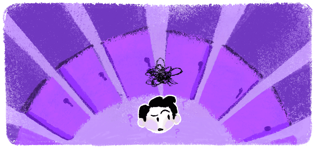
Why are users not signing up for the card?
The fintech app was experiencing drop-offs between initial onboarding to successful signups at various stages. Around 30% Users that were downloading the app based on marketing campaigns about credit building and loan eligibility dropped off after entering their phone number. With some research i.e user interviews through calling, checking data funnels and competitive analysis, there were some key observations that helped me gain insight into this and comfirmed my hypothesis.
Gap in mental model
Following the traditional image of credit cards, Users mistook the secured FD requirement for a scam or a hidden fee, leading to high drop-offs.
How do I make the users feel safe and see the secured credit card model clearly?
Lack of process & value visibility
Users who dropped off didn't have a single touchpoint that reminded them why they should bother coming back. They saw individual features but failed to see the upgrade that ZET was offering.
How can I create a unified Value Narrative that re-engages dormant users by showing them the full set of benefits in a digestible format?
Friction in flow
On landing for the first time, users had to navigate manual phone number verification, match personal details to documents and then wait for their credit score through an elaborate process. They were losing momentum before they even reached the product!
How do I change the high effort process to reduce friction in the limited timeline for first time users?
01
Onboarding
Users definitely judge the book by the color. Simply put, we need to show them what the product offers, how they can benefit, yet make it fast.
The onboarding needed to a brief value preview highlighting three core benefits: building your credit score, unlocking better offers, and accessing a fixed deposit backed card.
To make the transition easier and faster, an auto advance button ushers the users forward automatically while still giving them the option to proceed on their own. I created these animations in Lottie and co-ordinated with the tech team from start to finish to make sure the execution comes through.
02
Reminder: Ongoing Application
Once the user starts the application, mid journey dropoffs were our most immediate re engagement opportunity. Safe to assume they had intention
With the growth poc Hasmitha, to nudge them back I designed two touchpoints :
live notification showing their application status and time available
dynamic fallback screen on exit showing their current step.
03
Preactivation Value Retention: Stories
If the userreturns to the homepage during an ongoing application, a short story that shows them the full picture of what ZET offers in sequence, in under 30 seconds.
The design question was straightforward: what does a user need to see to feel like this is worth their money? I nagged the data team (haha) and pulled real cashback plus rewards data from 2026 through UPI, Vouchers and Other benefits we provided to ground the ZET's value to the user in actual numbers rather than vague promises. Each screen covers one benefit. The last screen, showcasing all the value as a summary leads the user to continue his journey.
This was built as an A/B experiment that is currently live on ZET app.
